
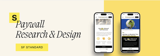
SF Standard Mobile Paywall Redesign
Turning the friction of subscription into a bridge to community
SF Standard Mobile Paywall Redesign
Turning the friction of subscription into a bridge to community
The Challenge
The Challenge
When you're commuting on Muni, reading about the latest Giants trade on your phone, the last thing you want is a paywall that feels like a digital brick wall. Yet here's the paradox: quality local journalism can't survive without subscriptions.
SF Standard tasked me with redesigning their mobile paywall experience—that critical moment when free readers must decide whether San Francisco's stories are worth paying for. The challenge wasn't just about conversion rates; it was about respecting the unique relationship between a city and its news.
The Assignment: Redesign the mobile paywall experience for SF Standard to increase subscription conversions while maintaining a positive user experience for local San Francisco news readers.
Duration: 4 days in June 2025
Role: Product Design Intern Candidate
Tools: Figma, Adobe Photoshop
Duration: 4 days
Role: Product Design Intern Candidate
Tools: Figma, Adobe Photoshop
Project Overview
Project Overview
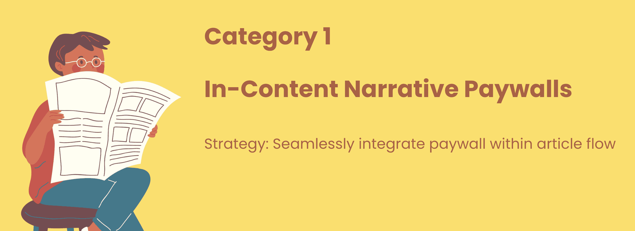
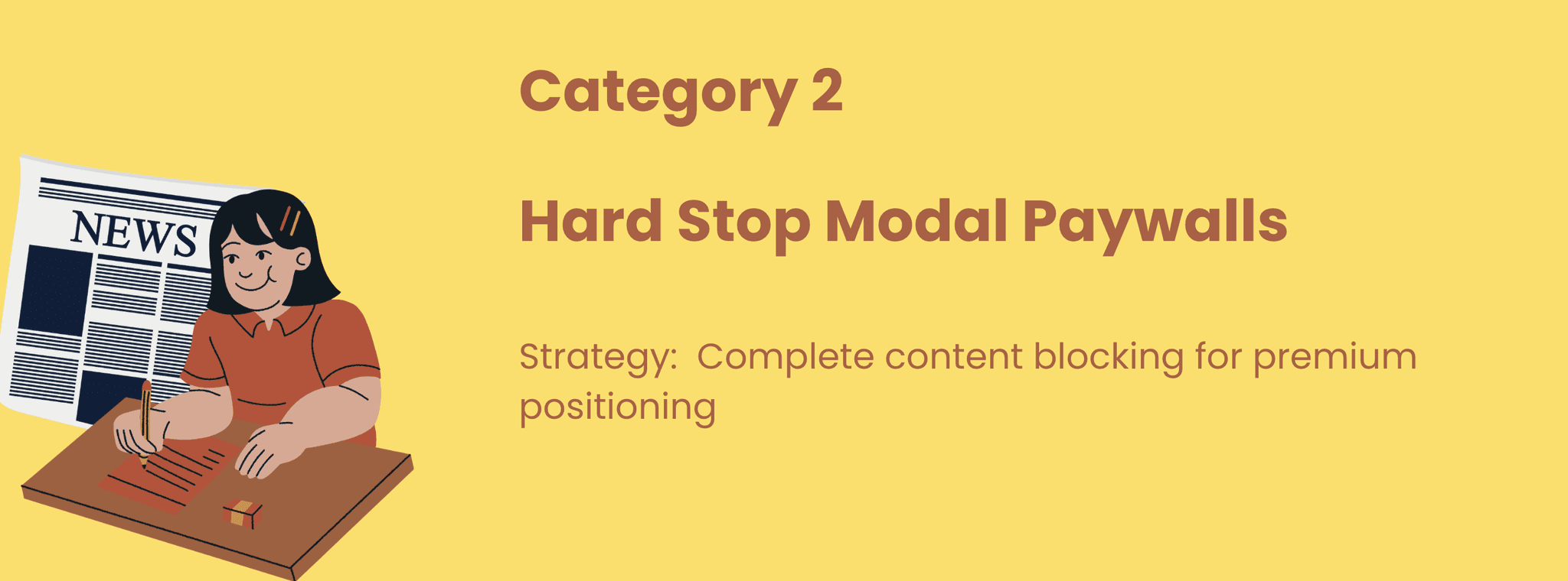
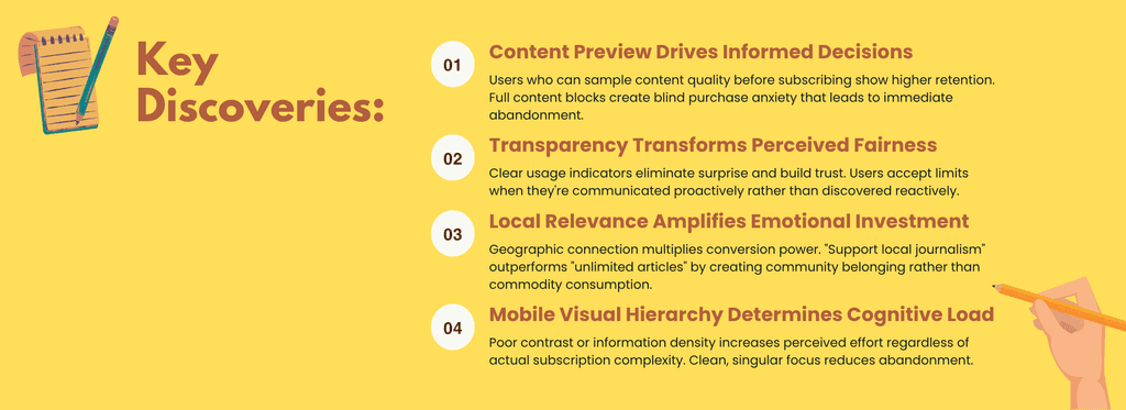
I analyzed 9 news publications across three strategic categories to understand what works—and what doesn't—when asking people to pay for journalism on their phones.
Research Insights
What makes mobile paywall experiences effective vs. frustrating?
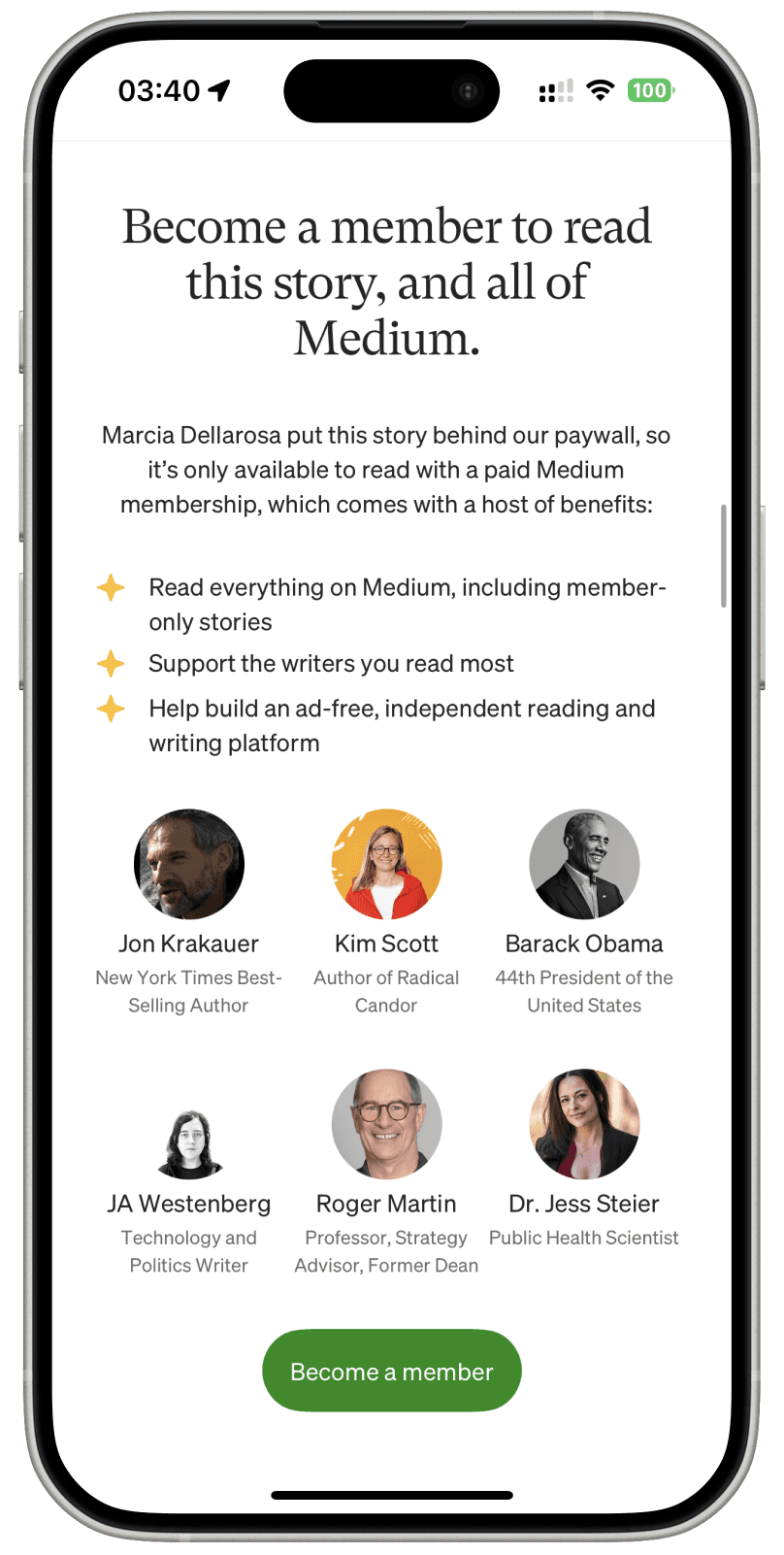
Medium
Exceptional use of social proof with recognizable figures creates trust and urgency. The author-centric messaging personalizes the value proposition, making subscription feel like supporting creators rather than just accessing content.

I analyzed 9 news publications across three strategic categories to understand what works—and what doesn't—when asking people to pay for journalism on their phones.
Research Insights
What makes mobile paywall experiences effective vs. frustrating?
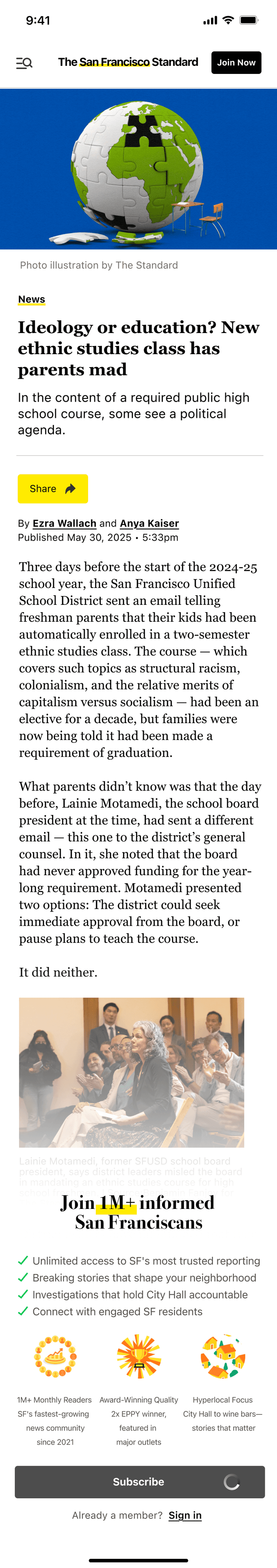
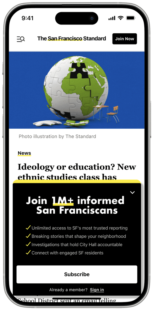
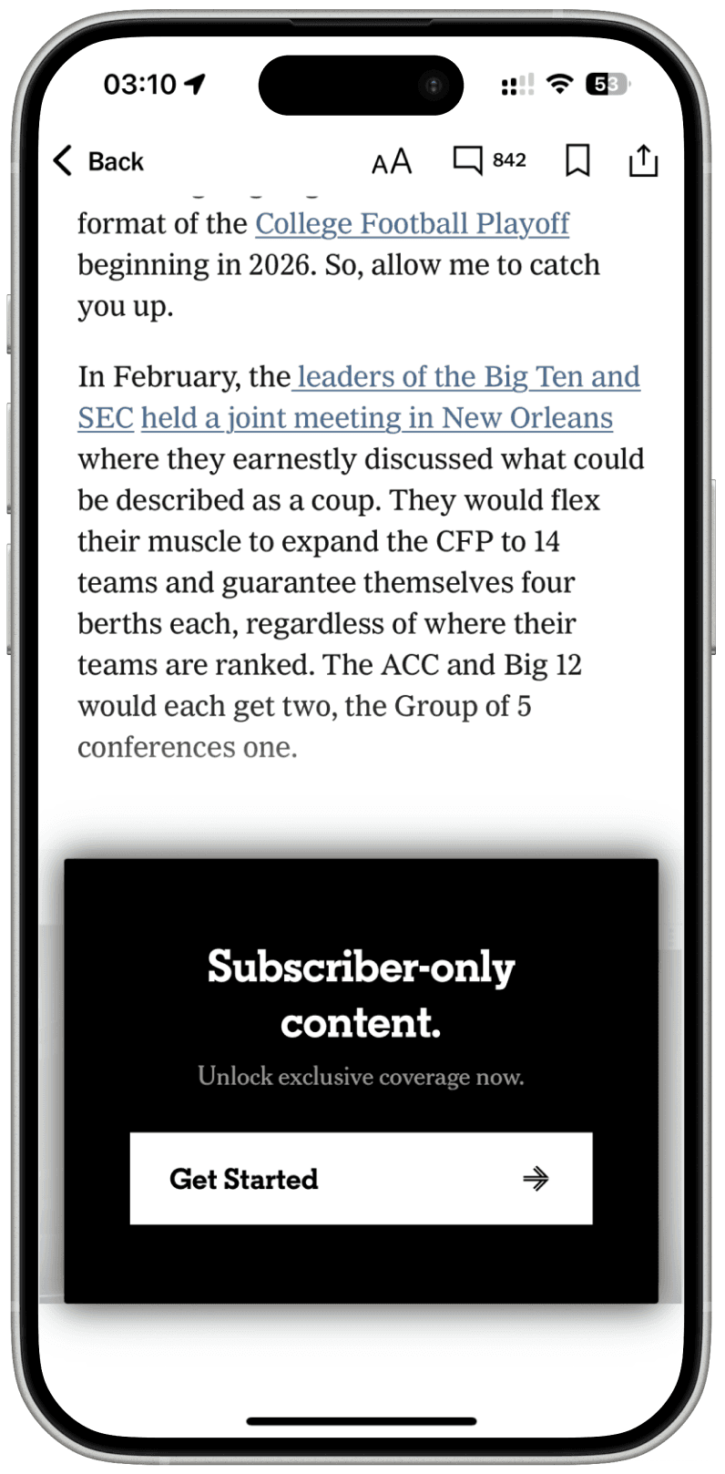
The Strategy: Position the paywall mid-article to leverage engagement momentum rather than disrupting initial reading flow.
Content Teasing: Users can assess article quality and relevance before subscription decision, reducing blind purchase anxiety.
SF Identity Emphasis: "Join 1M+ informed San Franciscans" creates local community belonging with appealing numbers rather than generic subscriber count.
Visual Credibility Enhancement: Three distinctive achievement icons (readership growth, editorial excellence, local focus) provide immediate social proof without text overload, reducing cognitive burden while reinforcing SF Standard's unique market position.
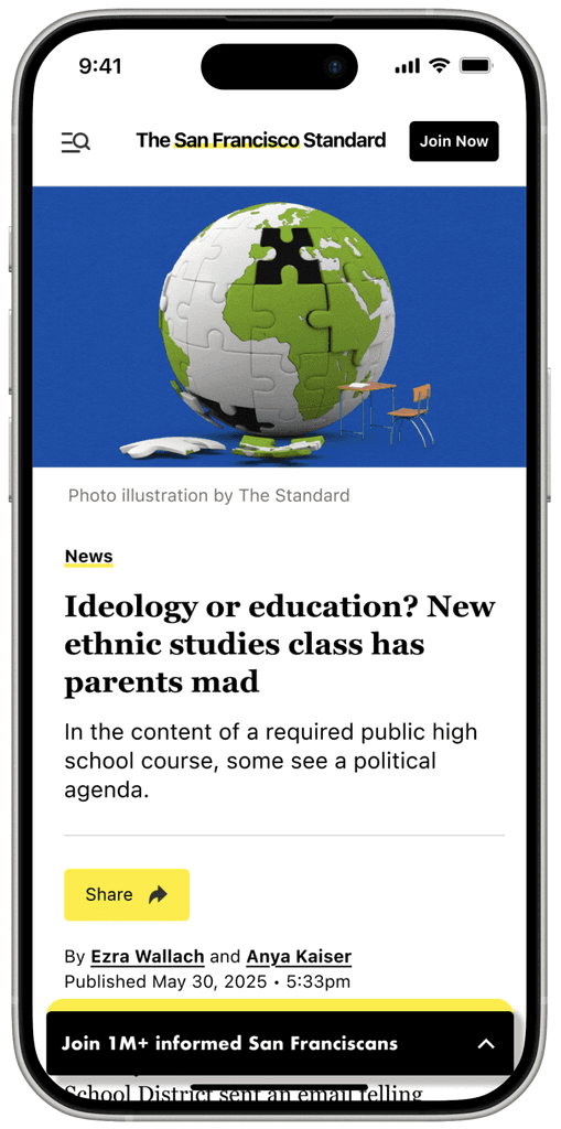
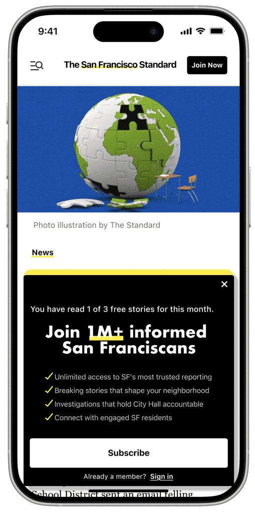
User Agency Preservation: Chevron dismiss functionality respects user autonomy while maintaining conversion opportunity.
Non-Intrusive Positioning: Bottom overlay preserves article visibility and reading context.
Flexible Engagement: Users can continue reading or engage with subscription offer based on content interest level.
Reduced Friction: Minimalist presentation lowers cognitive load compared to full-screen interruptions.
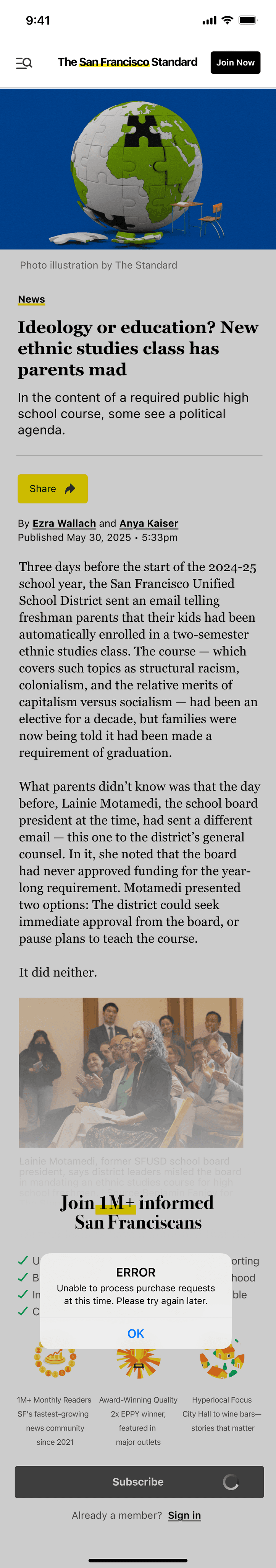
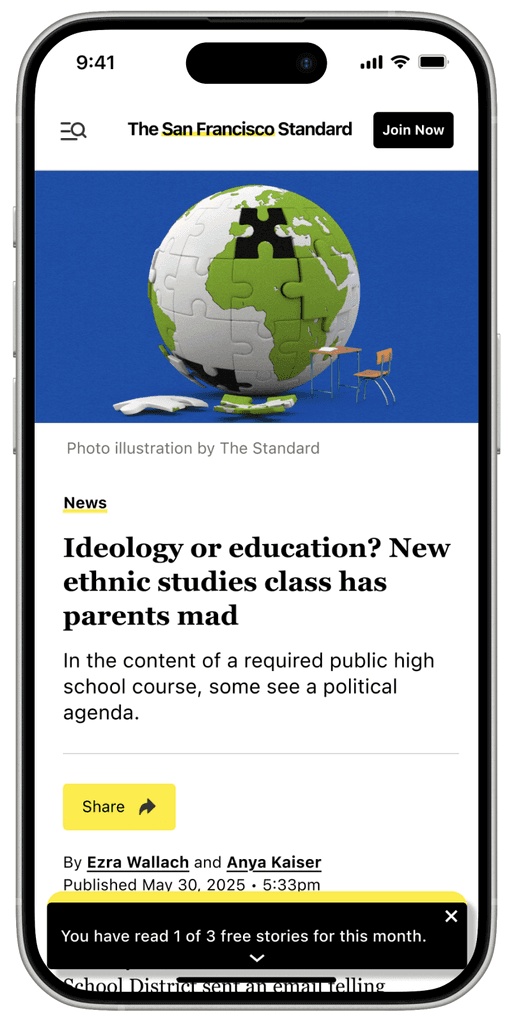
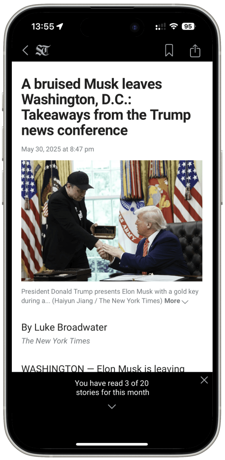
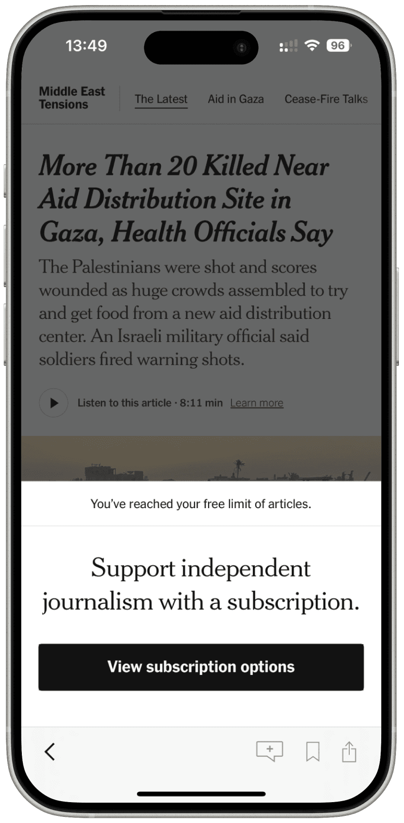
Before Users Hit the Limit: A slim bottom banner shows "You have read 1 of 3 free stories for this month"—respecting user agency by providing information without pressuring immediate action.
Progressive Disclosure: Users see exactly where they stand in their free article allocation, transforming potential surprise into informed decision-making.
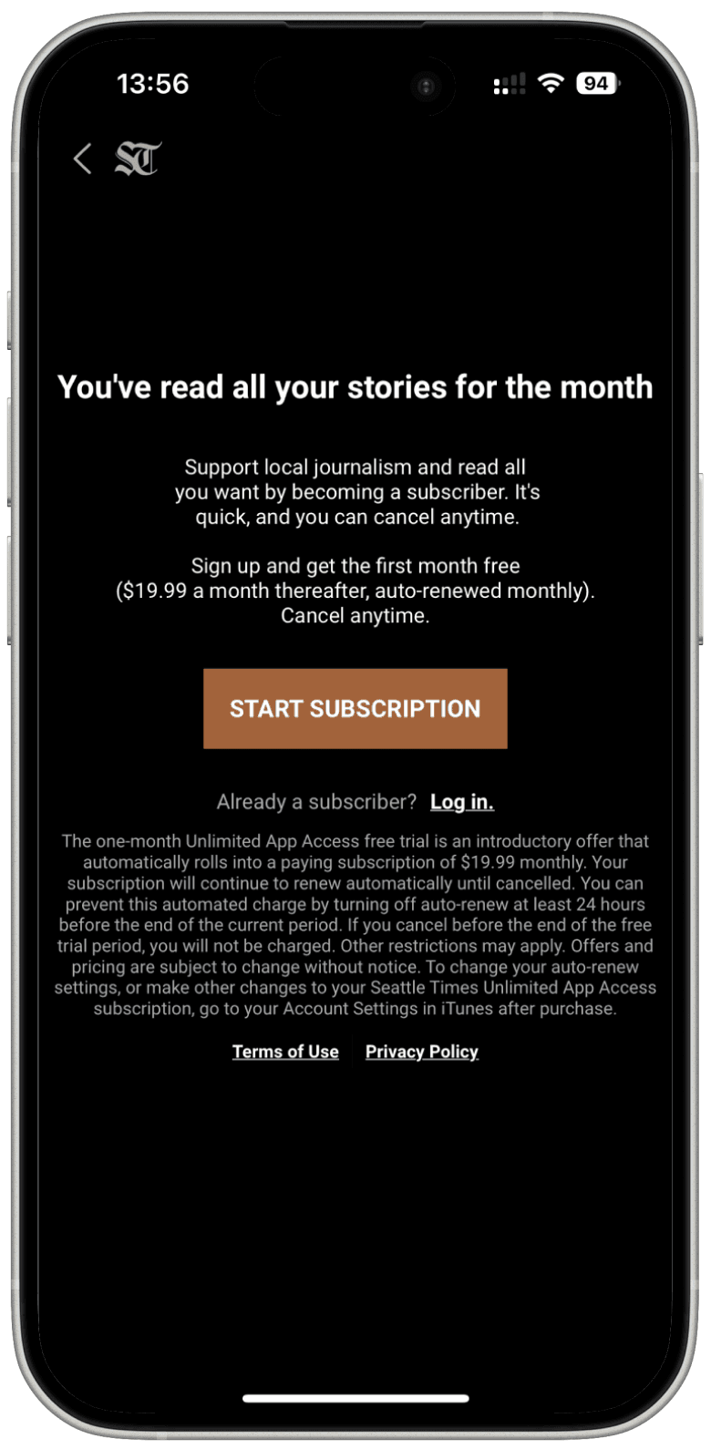
Respectful User Experience: Following Seattle Times' successful model, clear limit communication feels like helpful guidance rather than aggressive monetization.
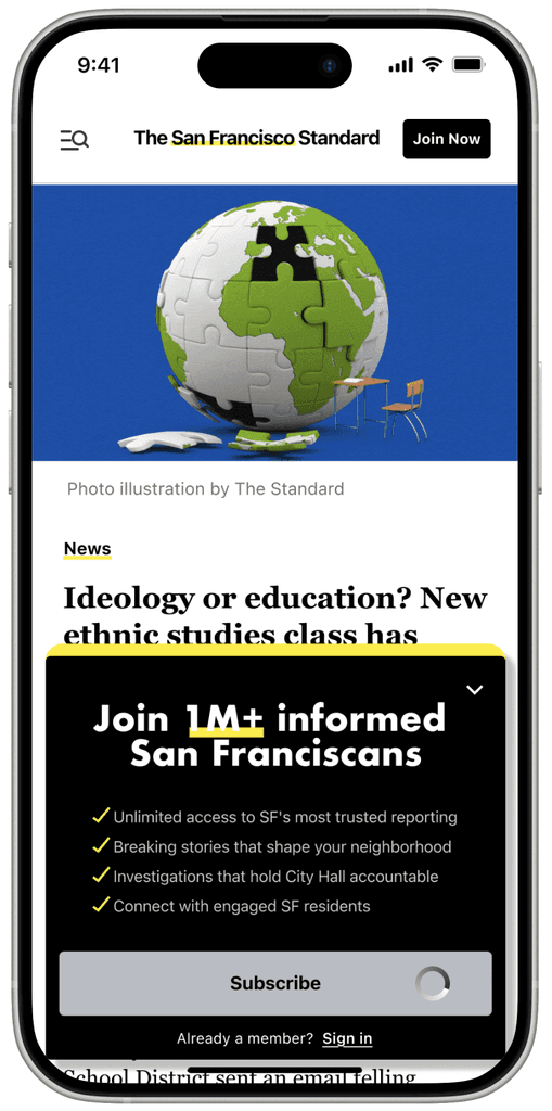
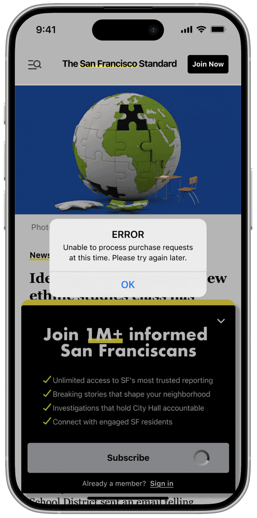
default
loading
error
default
chevron dismiss functionality
Solutions
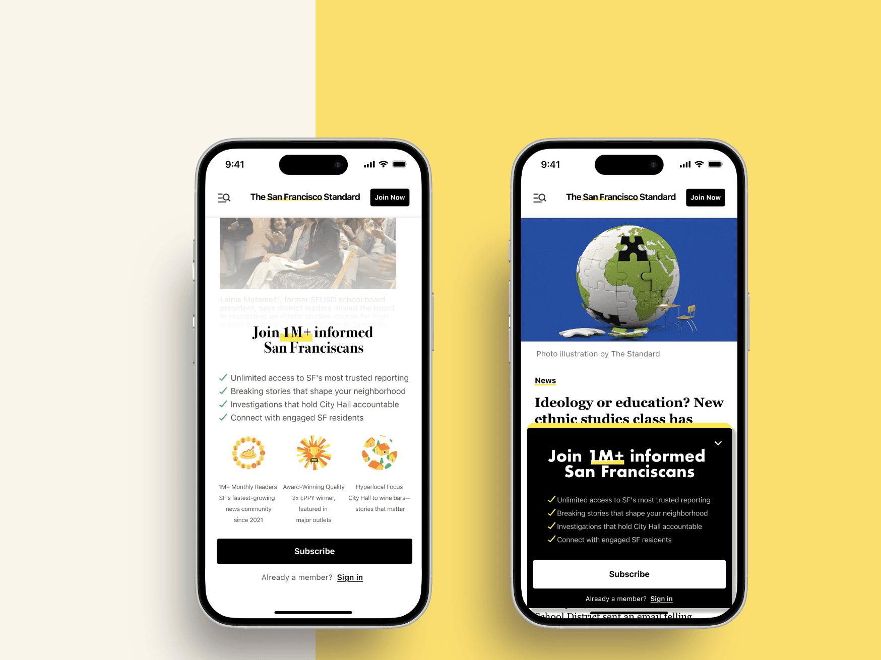
Version A: In-Content Narrative Paywall
Building anticipation rather than interruption
Version B: Dismissible Overlay Paywall
Respecting user agency while maintaining conversion opportunity

error
before users hitting the limit
chevron functionality
loading
The Transparency Layer
Building trust through clear communication
Exceptional use of social proof with recognizable figures creates trust and urgency. The author-centric messaging personalizes the value proposition, making subscription feel like supporting creators rather than just accessing content.
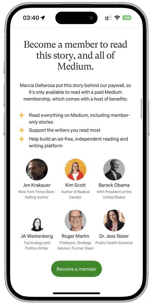
Medium
Design Characteristics:
Natural reading interruption point
Rich content with testimonials and social validation
Contextual messaging tied to specific content
Maintains article environment and reading flow
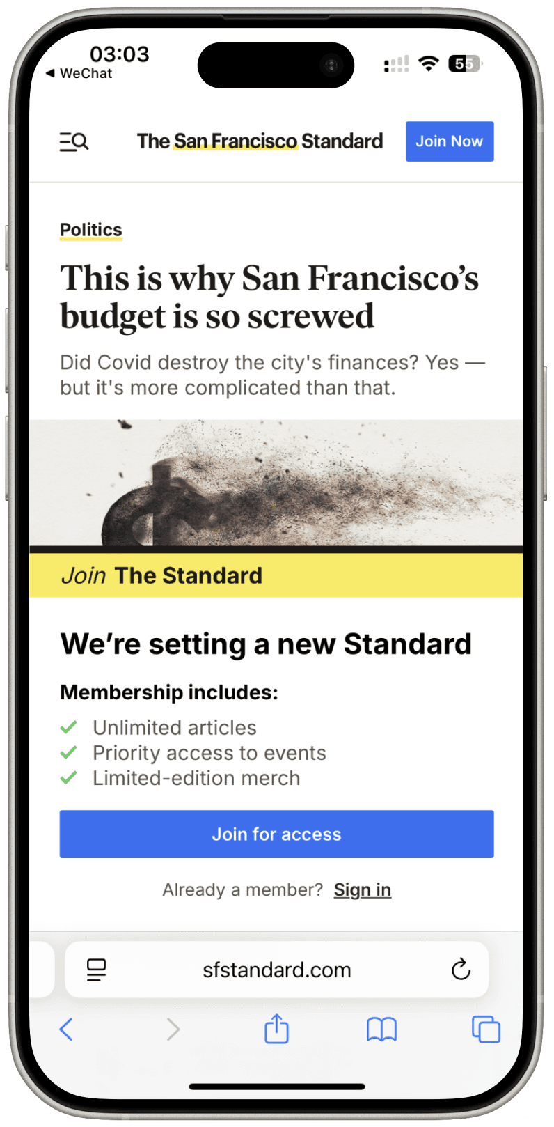
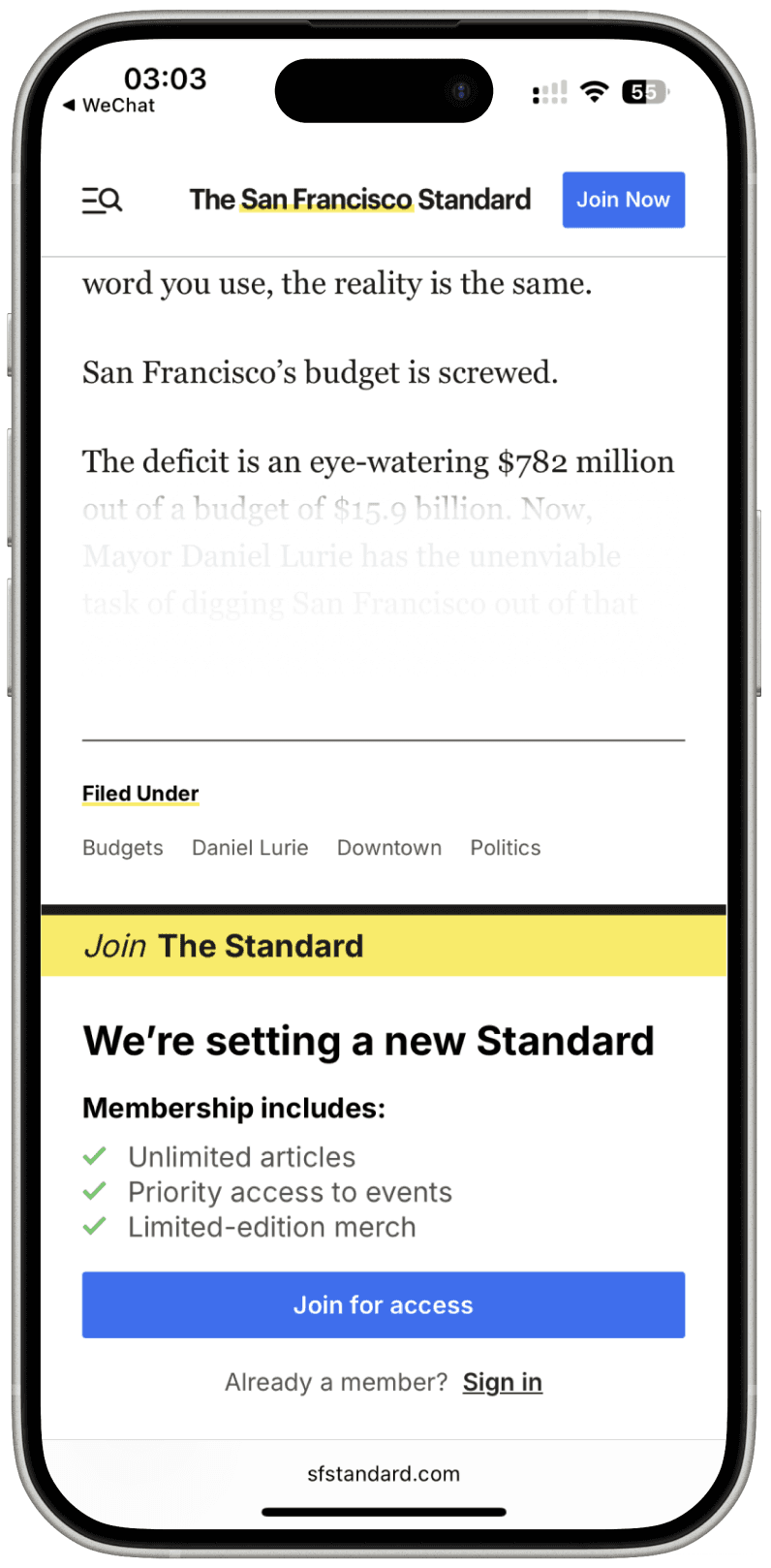
Clean brand consistency with clear benefit structure, but generic value propositions miss opportunities for San Francisco-specific community connection.
(BTW: 3 free articles/month but lacks transparent indicator)

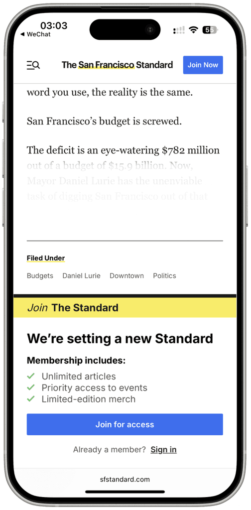
SF Standard
(my client)
Design Characteristics:
Strategic content teasing maintains engagement
Contextual conversion within reading flow
Lower abandonment through partial value demonstration
Balances discovery with subscription urgency

Excellent transparency with article counter builds trust, and "support local journalism" messaging creates emotional connection.
After hitting limitation: hard stop modal
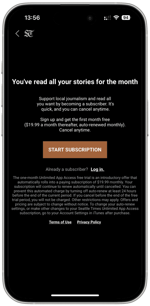


Seattle Times
Design Characteristics:
Complete content blocking with zero preview
Premium positioning through scarcity psychology
High-friction but high-intent user filtering
Risk: High immediate bounce rate for price-sensitive users
Benefit: Attracts committed subscribers willing to pay premium
Mobile-Specific: High cognitive load on small screens

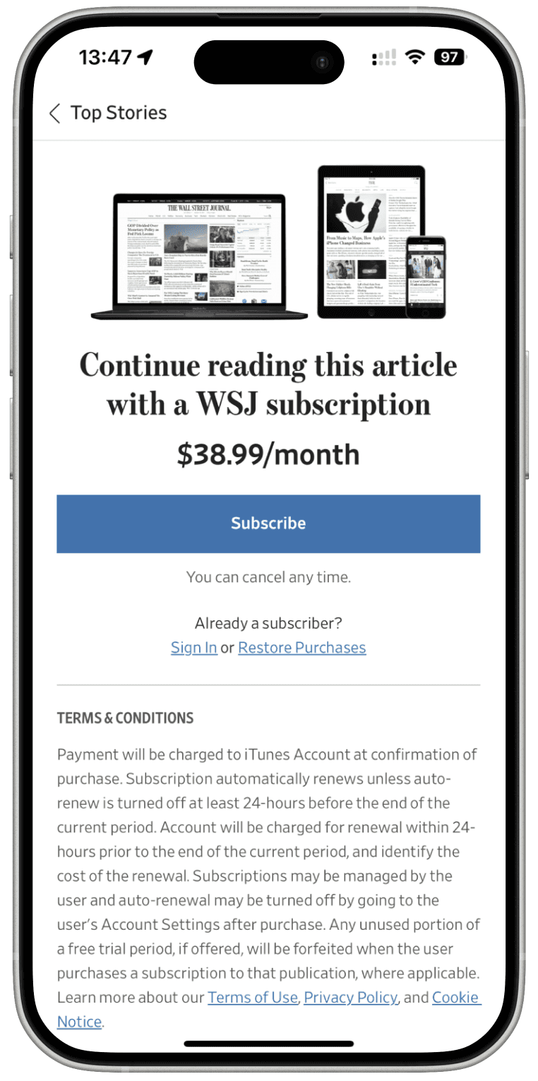
Premium pricing strategy ($38.99) with sophisticated device showcase, but overwhelming information density may cause decision paralysis for price-sensitive users.
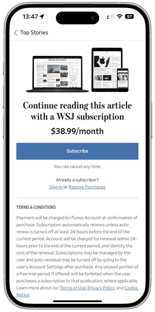
The Wall Street Journal

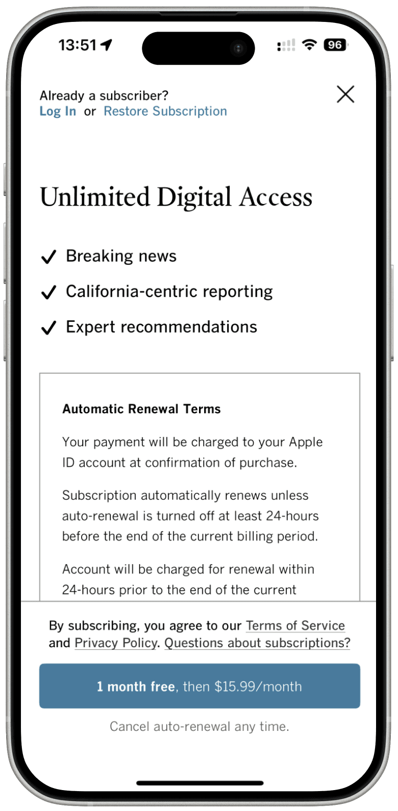
Geographic targeting ("California-centric") creates relevant local value, though the lengthy terms text creates visual clutter.
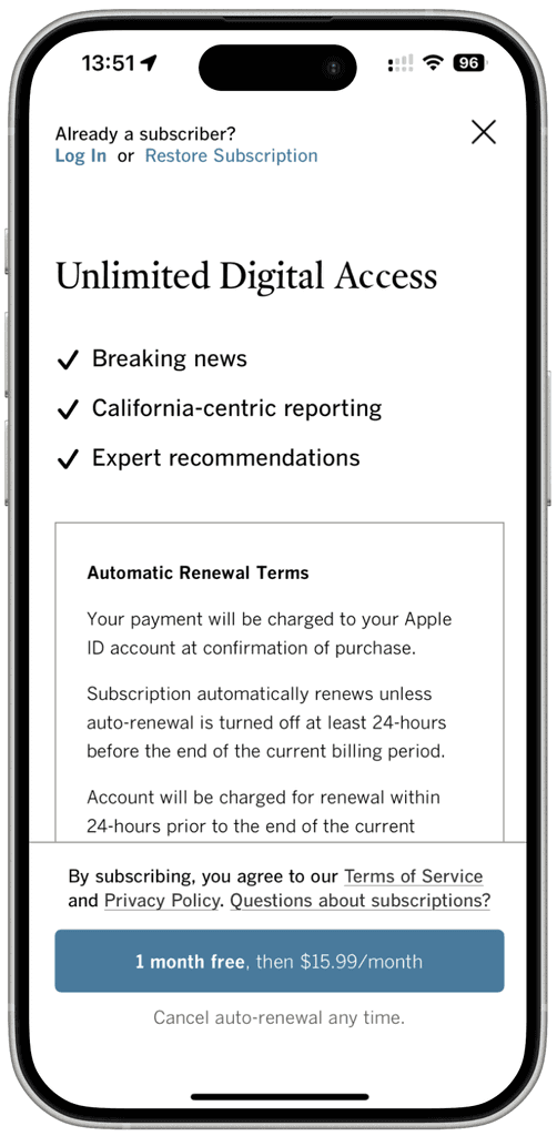
LA Times

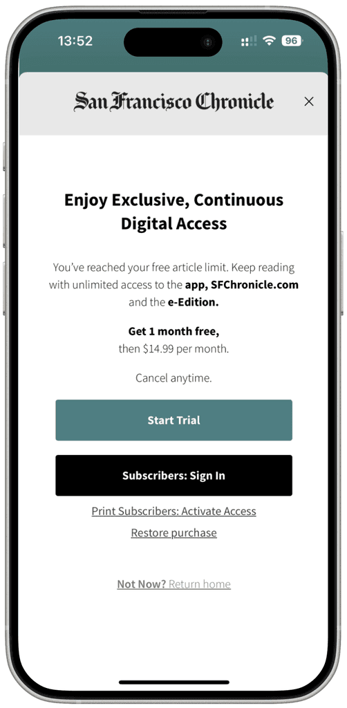
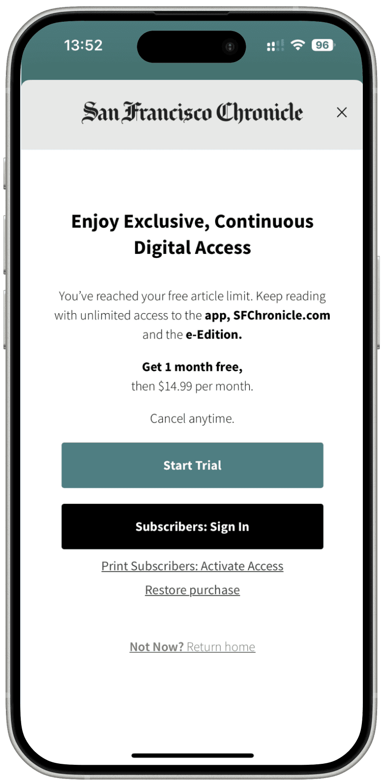
Very clean branded design with effective free trial positioning, but multiple user pathways (start trail, subscribers sign in, print subscribers, restore) may confuse first-time visitors.
San Francisco Chronicle

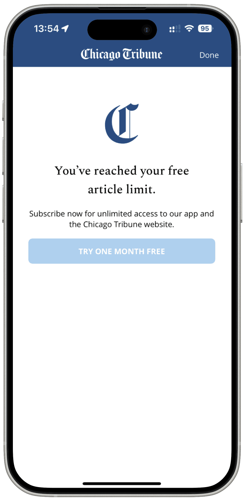
Minimalist approach reduces cognitive load, but the weak CTA contrast (pale blue) creates poor accessibility and conversion friction.
Chicago Tribune

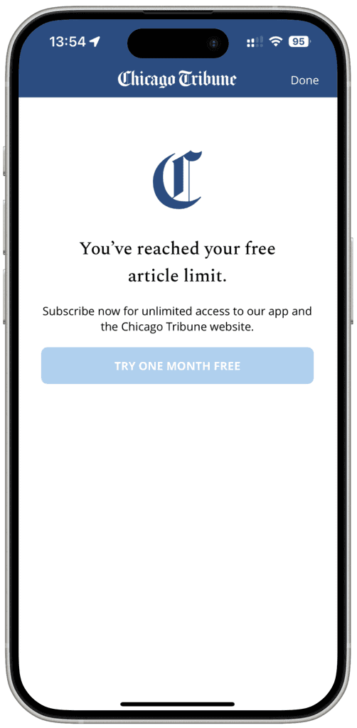
Stark simplicity reduces friction but lacks compelling reasons to convert beyond basic access messaging.
(The paywall and background are different colours to make them easy to tell apart.)
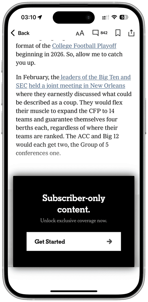
The Athletic

Strong "independent journalism" positioning maintains content visibility while building brand authority.
(The paywall and background are different colours to make them easy to tell apart.)
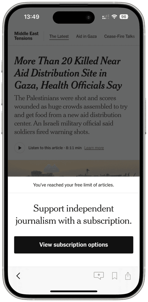
New York Times

Medium
Exceptional use of social proof with recognizable figures creates trust and urgency. The author-centric messaging personalizes the value proposition, making subscription feel like supporting creators rather than just accessing content.
Design Characteristics:
Natural reading interruption point
Rich content with testimonials and social validation
Contextual messaging tied to specific content
Maintains article environment and reading flow
The Wall Street Journal
Premium pricing strategy ($38.99) with sophisticated device showcase, but overwhelming information density may cause decision paralysis for price-sensitive users.
LA Times
Geographic targeting ("California-centric") creates relevant local value, though the lengthy terms text creates visual clutter.
San Francisco Chronicle
Very clean branded design with effective free trial positioning, but multiple user pathways (start trail, subscribers sign in, print subscribers, restore) may confuse first-time visitors.
Chicago Tribune
Minimalist approach reduces cognitive load, but the weak CTA contrast (pale blue) creates poor accessibility and conversion friction.
Seattle Times
Excellent transparency with article counter builds trust, and "support local journalism" messaging creates emotional connection.
After hitting limitation: hard stop modal
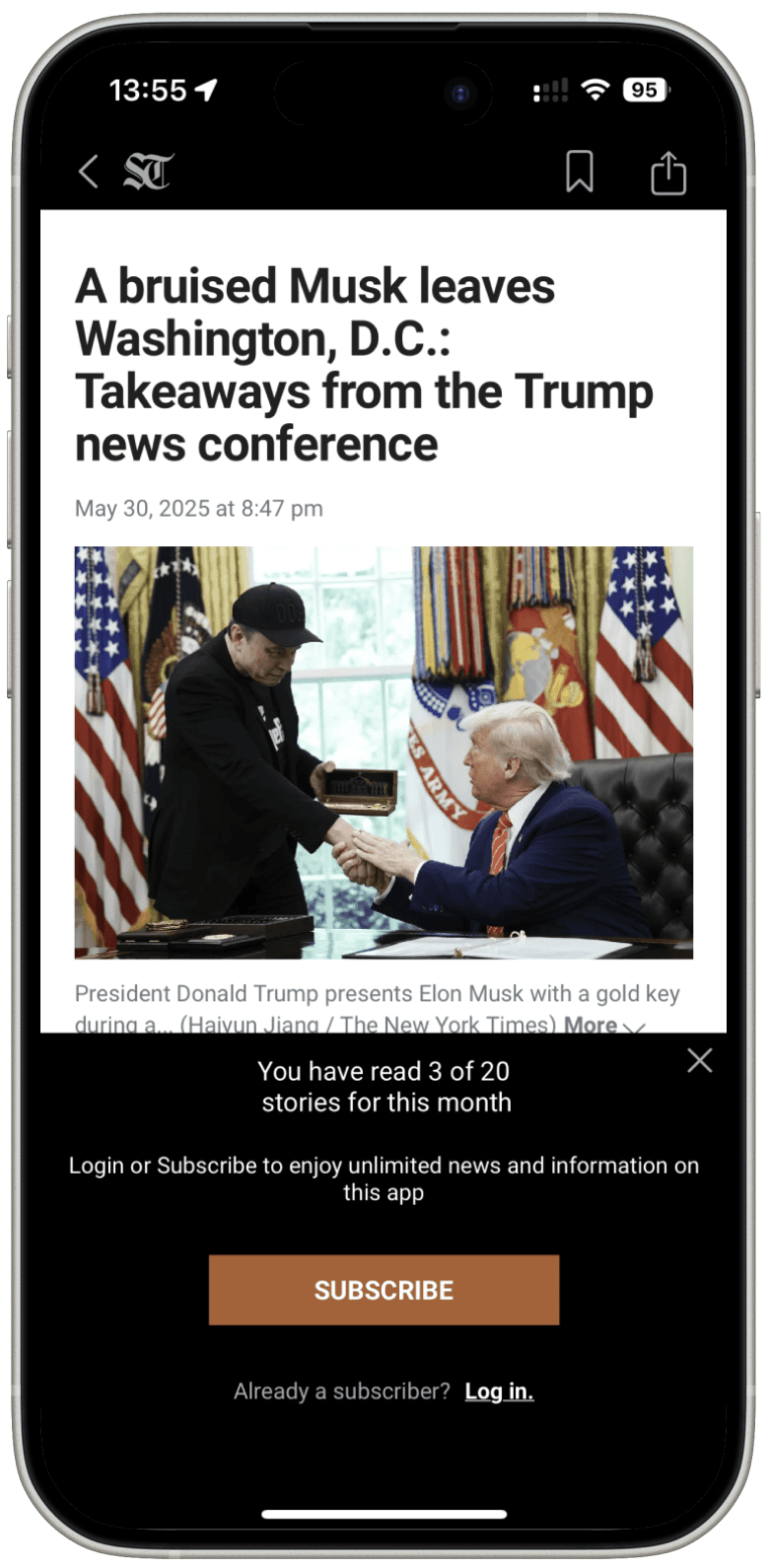
Design Characteristics:
Complete content blocking with zero preview
Premium positioning through scarcity psychology
High-friction but high-intent user filtering
Risk: High immediate bounce rate for price-sensitive users
Benefit: Attracts committed subscribers willing to pay premium
Mobile-Specific: High cognitive load on small screens
The Athletic
Stark simplicity reduces friction but lacks compelling reasons to convert beyond basic access messaging.
(The paywall and background are different colours to make them easy to tell apart.)
New York Times
Strong "independent journalism" positioning maintains content visibility while building brand authority.
(The paywall and background are different colours to make them easy to tell apart.)
SF Standard
(my client)
Clean brand consistency with clear benefit structure, but generic value propositions miss opportunities for San Francisco-specific community connection.
(BTW: 3 free articles/month but lacks transparent indicator)
Design Characteristics:
Strategic content teasing maintains engagement
Contextual conversion within reading flow
Lower abandonment through partial value demonstration
Balances discovery with subscription urgency
Solutions
Version A: In-Content Narrative Paywall
Building anticipation rather than interruption
default
loading
error

The Strategy: Position the paywall mid-article to leverage engagement momentum rather than disrupting initial reading flow.
Content Teasing: Users can assess article quality and relevance before subscription decision, reducing blind purchase anxiety.
SF Identity Emphasis: "Join 1M+ informed San Franciscans" creates local community belonging with appealing numbers rather than generic subscriber count.
Visual Credibility Enhancement: Three distinctive achievement icons (readership growth, editorial excellence, local focus) provide immediate social proof without text overload, reducing cognitive burden while reinforcing SF Standard's unique market position.
Version B: Dismissible Overlay Paywall
Respecting user agency while maintaining conversion opportunity
default
loading
error
chevron dismiss functionality
User Agency Preservation: Chevron dismiss functionality respects user autonomy while maintaining conversion opportunity.
Non-Intrusive Positioning: Bottom overlay preserves article visibility and reading context.
Flexible Engagement: Users can continue reading or engage with subscription offer based on content interest level.
Reduced Friction: Minimalist presentation lowers cognitive load compared to full-screen interruptions.
The Transparency Layer
Building trust through clear communication
before users hitting the limit
chevron functionality
Before Users Hit the Limit: A slim bottom banner shows "You have read 1 of 3 free stories for this month"—respecting user agency by providing information without pressuring immediate action.
Progressive Disclosure: Users see exactly where they stand in their free article allocation, transforming potential surprise into informed decision-making.
Respectful User Experience: Following Seattle Times' successful model, clear limit communication feels like helpful guidance rather than aggressive monetization.
The Insight
The Insight
Invitation, not barrier
Invitation, not barrier
The most effective paywalls don't feel like paywalls. They feel like invitations to join something bigger than yourself—your community's conversation, your city's future, your neighbors' shared story.
In San Francisco, that connection runs deeper than most places. The question isn't whether the content is worth paying for. It's whether staying informed about your city—your home—is worth it.
The answer, for most San Franciscans, is yes. We just needed to ask the right way.