
Berry Berry Hair Salon Website Redesign
A Japanese Hair Salon's Transformation from Frustration to Efficiency
Berry Berry Hair Salon Website Redesign
A Japanese Hair Salon's Transformation from Frustration to Efficiency
Duration: Sept 2024 - Dec 2024
Role: UX Researcher & Designer
Client: Berry Berry Hair Salon (Seattle-based boutique Japanese salon)
Tools: Figma, Adobe Photoshop, Canva
Scope: Academic solo project focusing on website redesign
Duration: Sept 2024 - Dec 2024
Role: UX Researcher & Designer
Client: Berry Berry Hair Salon (Seattle-based boutique Japanese salon)
Tools: Figma, Adobe Photoshop, Canva
Scope: Academic solo project focusing on website redesign
Project Overview
Project Overview
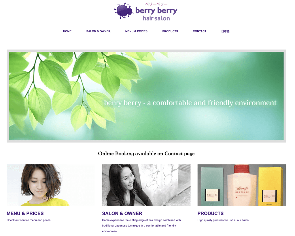
Berry Berry Hair Salon brings 20+ years of Japanese hair expertise to Seattle's community. While their artistry thrives in-store, their digital presence struggled to match their stellar reputation.
Berry Berry Hair Salon brings 20+ years of Japanese hair expertise to Seattle's community. While their artistry thrives in-store, their digital presence struggled to match their stellar reputation.
Background
Background
The Challenge
The Challenge
Despite a loyal customer base built on exceptional service, potential clients faced a digital obstacle course:
A 9-step booking process requiring third-party registration
No gallery for style possibilities
Limited product information leaving clients uncertain
Despite a loyal customer base built on exceptional service, potential clients faced a digital obstacle course:
A 9-step booking process requiring third-party registration
No gallery for style possibilities
Limited product information leaving clients uncertain
Research & Discovery
Research & Discovery
Competitive Analysis
Competitive Analysis
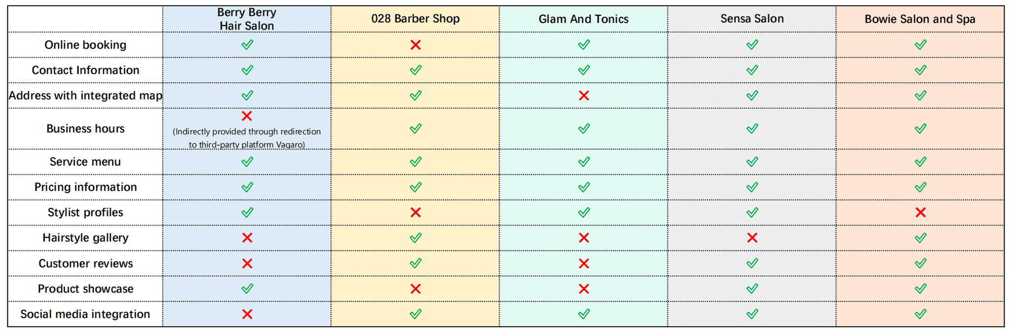
Key Findings:
Most competitors offer integrated booking systems
Gallery and reviews are standard features
Social media integration enhances engagement
Key Findings:
Most competitors offer integrated booking systems
Gallery and reviews are standard features
Social media integration enhances engagement
User Interviews
User Interviews
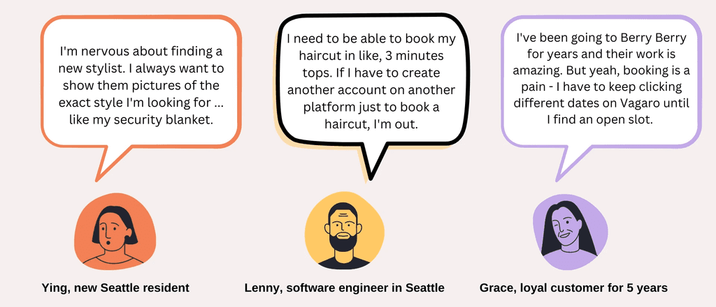
Key Findings:
Modern clients seek visual references before committing to a style
Booking convenience directly impacts client acquisition
Clear time slot availability is crucial
Key Findings:
Modern clients seek visual references before committing to a style
Booking convenience directly impacts client acquisition
Clear time slot availability is crucial
Persona
&
Problem Statement
Persona & Problem Statement
Alex Johnson is a busy software engineer who needs a simple and streamlined way to book a haircut online that aligns with his available time because he values efficiency and wants to avoid the frustration of discovering scheduling conflicts after booking.
Alex Johnson is a busy software engineer who needs a simple and streamlined way to book a haircut online that aligns with his available time because he values efficiency and wants to avoid the frustration of discovering scheduling conflicts after booking.
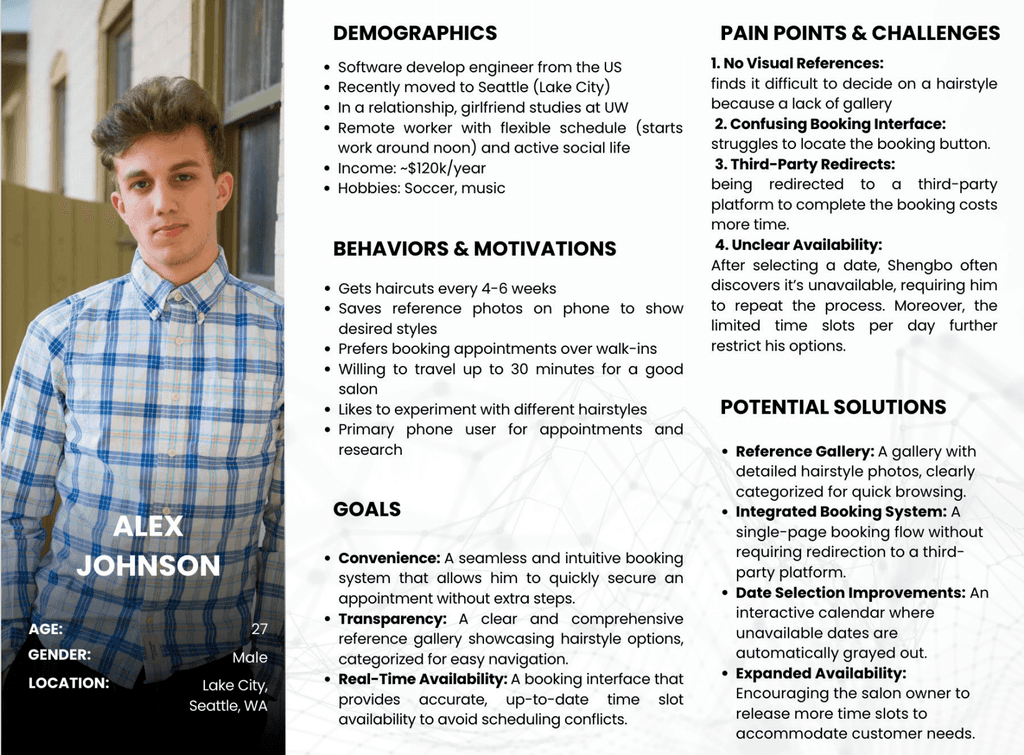
Meet Alex!
Final Pain Points Summary
Final Pain Points Summary
1. Booking Issues
• Lack of clear CTA for appointment booking.
• Users face trial-and-error when selecting dates, as availability isn’t displayed upfront.
• The booking process is overly complicated, requiring 9 steps and third-party redirection.
2. Missing Information
• No gallery to showcase services or styles.
• Product page lacks descriptions, offering only product names.
• Key details like business hours, customer reviews, social media links and contact form are absent.
2. Missing Information
• No gallery to showcase services or styles.
• Product page lacks descriptions, offering only product names.
• Key details like business hours, customer reviews, social media links and contact form are absent.
Design Process
Design Process
Information Architecture
Information Architecture
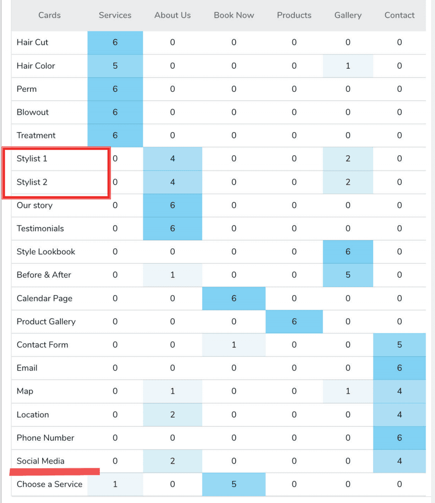
card sorting
Closed
6 categories and 20 cards
6 results
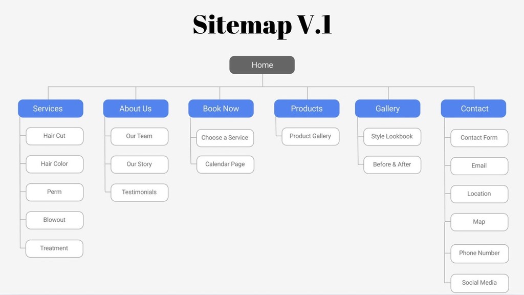
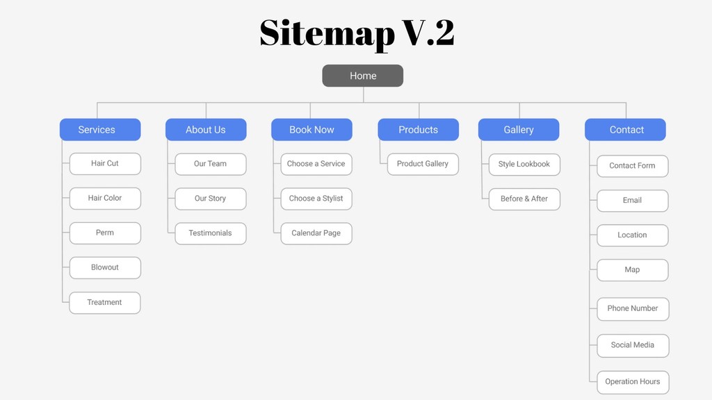
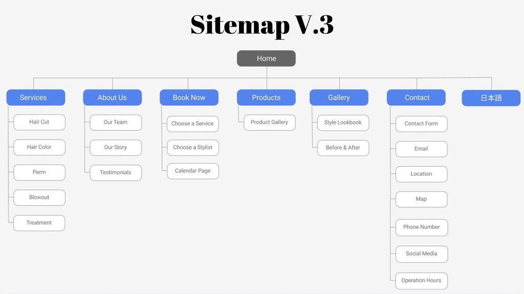
sitemap
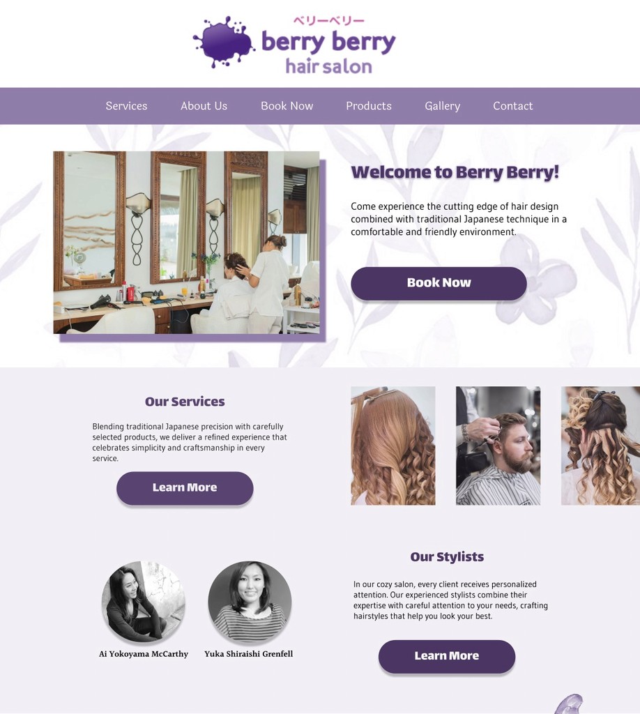
The site structure evolved through 3 key iterations, informed by card sorting results with 6 participants:
Evolution Highlights:
V1: Established core navigation structure
V2: Added granular details (stylist selection under Book Now, business hours under Contact)
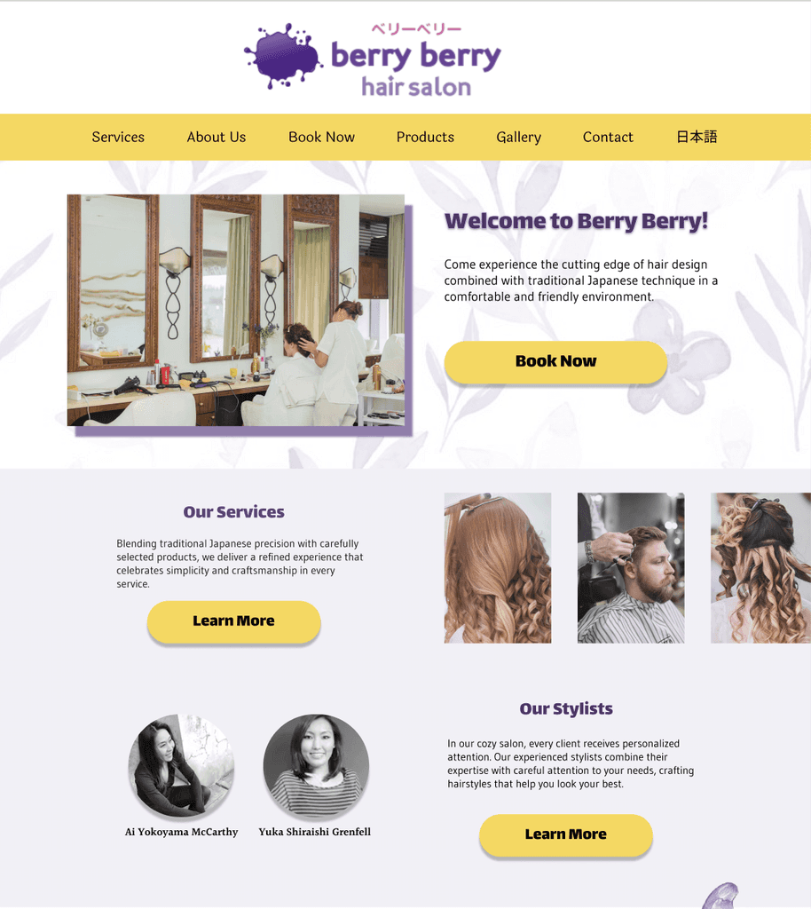
V3: Integrated Japanese language option (日本語) to serve Seattle's Japanese community
Final navigation structure:
Services
About Us
Book Now
Products
Gallery
Contact
日本語
card sorting
(Closed,6 categories and 20 cards, 6 results)
sitemap
The site structure evolved through 3 key iterations, informed by card sorting results with 6 participants:
Evolution Highlights:
V1: Established core navigation structure
V2: Added granular details (stylist selection under Book Now, business hours under Contact)
V3: Integrated Japanese language option (日本語) to serve Seattle's Japanese community
Final navigation structure:
Services
About Us
Book Now
Products
Gallery
Contact
日本語
Design Evolution
Design Evolution
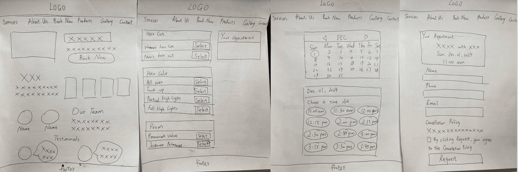
paper wireframe
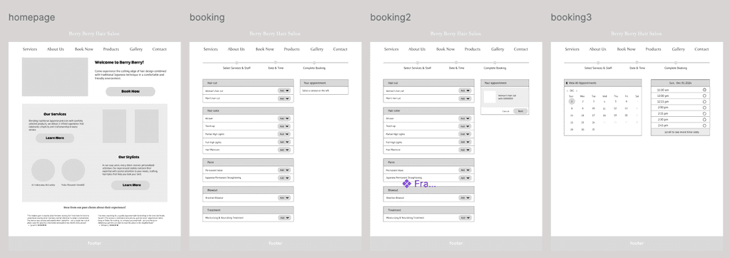
low-fi prototype
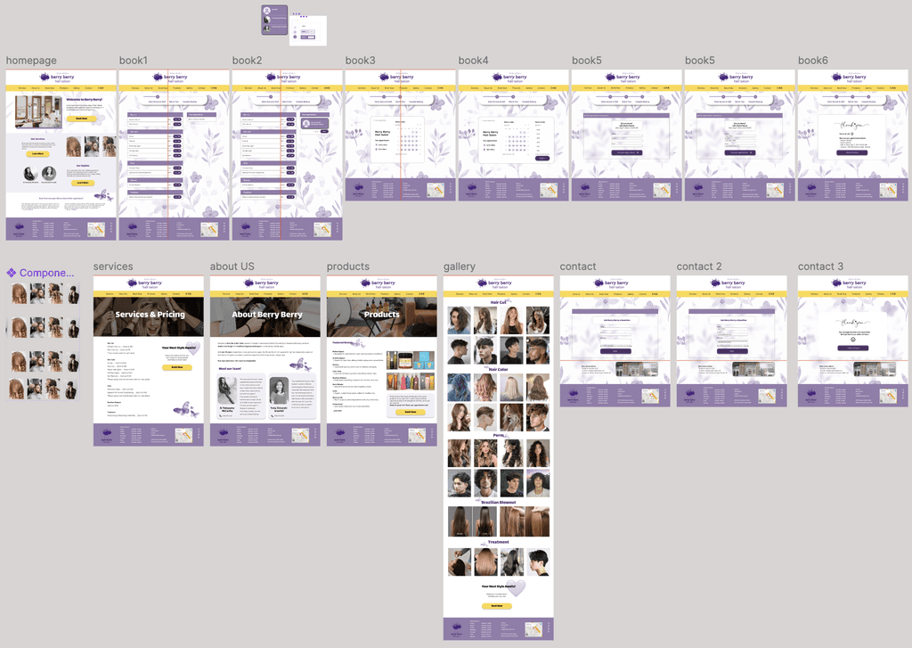
hi-fi prototype
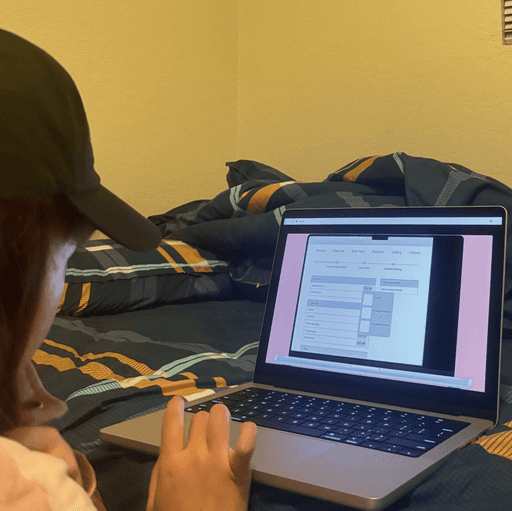
User Testing & Iteration
User Testing & Iteration
Key Insights
&
Improvements
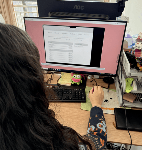
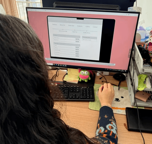
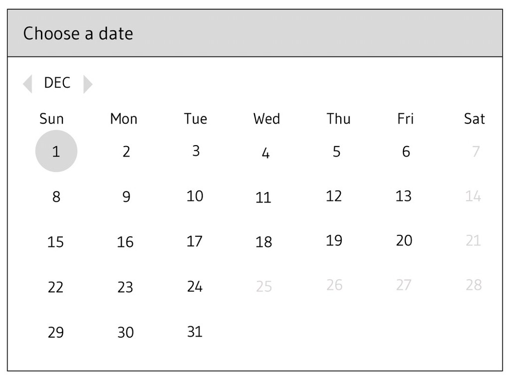
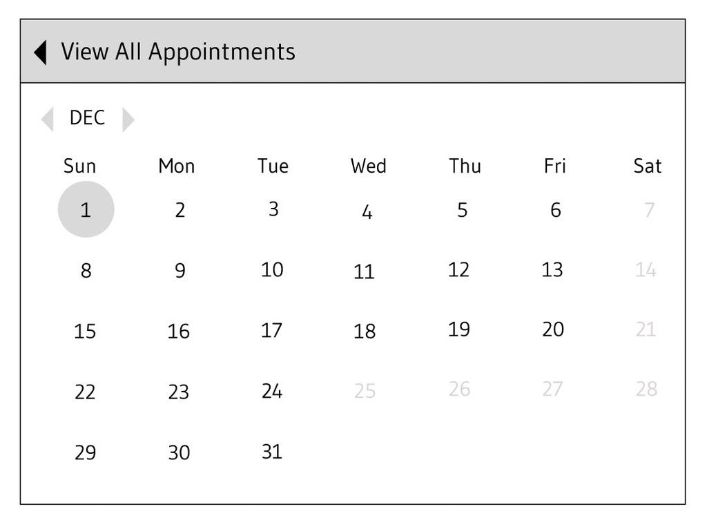
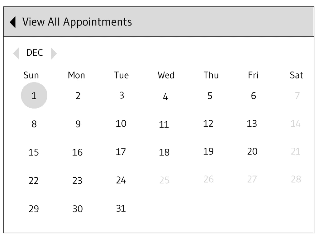
Conducted usability testing at multiple stages of design, including paper wireframes, low-fidelity prototypes, and high-fidelity prototypes, ensuring user feedback informed every step of the process. Key insights and improvements included:
1. Back Navigation Enhancement:
Introduced back navigation in the booking flow, simplifying user interactions and minimizing frustration.
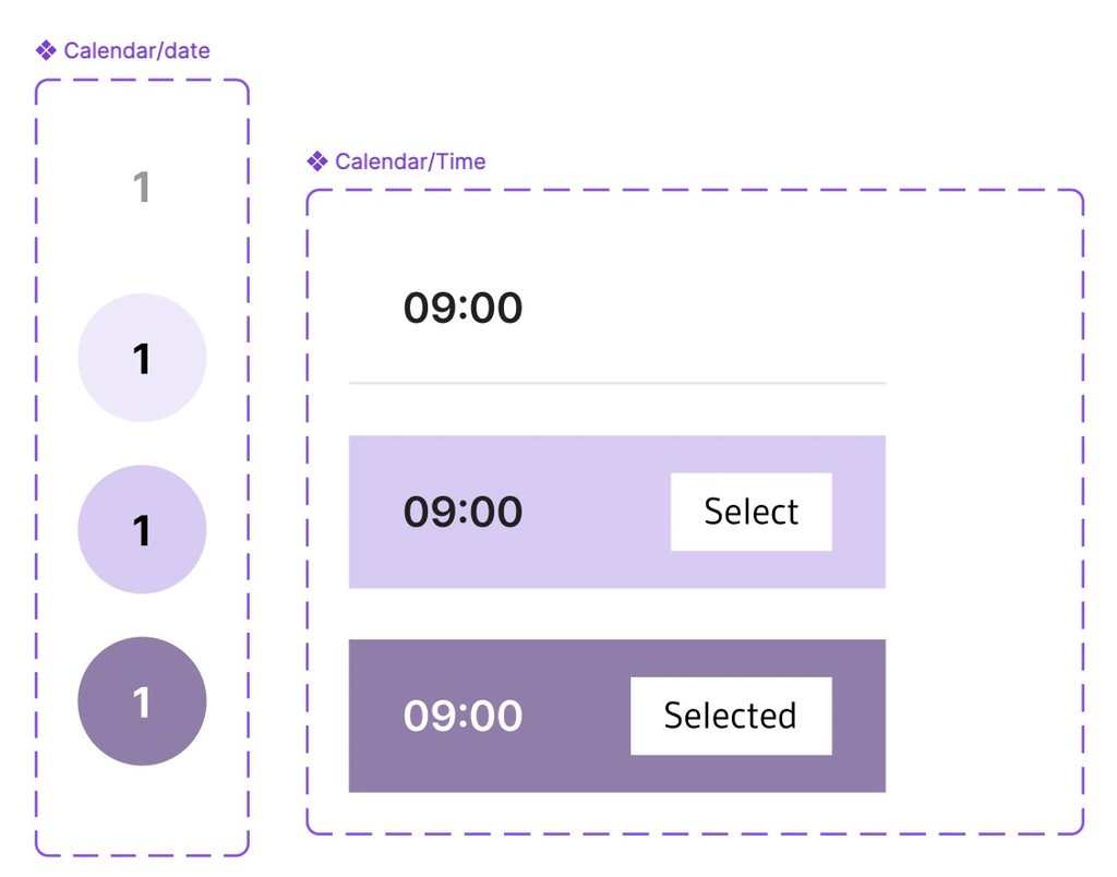
2. Enhanced Visual Feedback:
Implemented dynamic color changes for time slot selection, as users expressed a preference for clear visual feedback—hovering highlights in one color and final selections in another.
One user noted, “It’s so much easier to know what I’ve chosen now!”
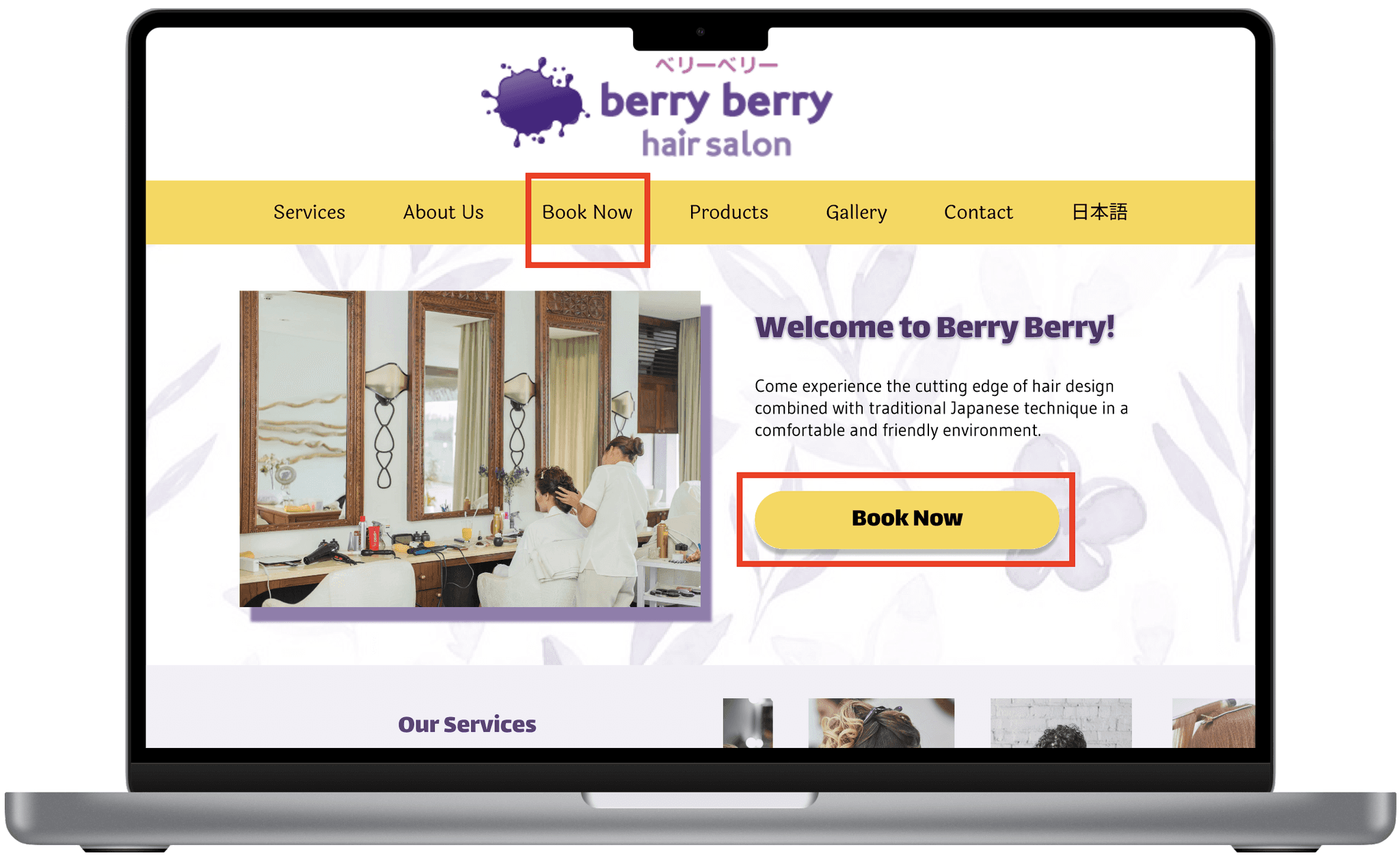
3. Color Contrast Optimization:
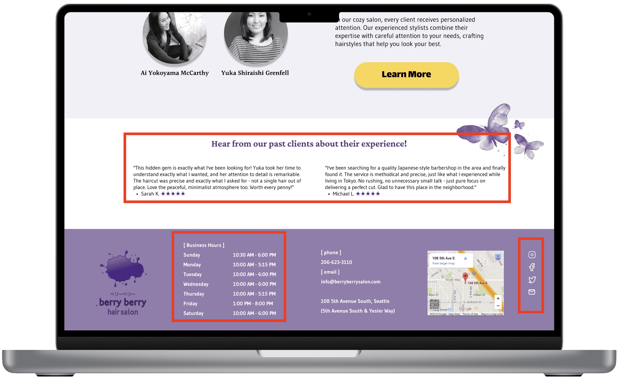
Introduced yellow accents CTAs and navigation elements against the purple color scheme to ensure that crucial user interactions are visually distinct from the rest of the design. User testing confirmed enhanced scanability and faster task completion.
Conducted usability testing at multiple stages of design, including paper wireframes, mid-fidelity prototypes, and high-fidelity prototypes, ensuring user feedback informed every step of the process.
Key insights and improvements included:
1. Back Navigation Enhancement:
Introduced back navigation in the booking flow, simplifying user interactions and minimizing frustration.
Key insights and improvements included:
1. Back Navigation Enhancement:
Introduced back navigation in the booking flow, simplifying user interactions and minimizing frustration.
2. Enhanced Visual Feedback:
Implemented dynamic color changes for time slot selection, as users expressed a preference for clear visual feedback—hovering highlights in one color and final selections in another.
One user noted, “It’s so much easier to know what I’ve chosen now!”
2. Enhanced Visual Feedback:
Implemented dynamic color changes for time slot selection, as users expressed a preference for clear visual feedback—hovering highlights in one color and final selections in another.
One user noted, “It’s so much easier to know what I’ve chosen now!”
3. Color Contrast Optimization:
Introduced warm orange accents CTAs and navigation elements against the purple color scheme to ensure that crucial user interactions are visually distinct from the rest of the design. User testing confirmed enhanced scanability and faster task completion.
3. Color Contrast Optimization:
Introduced warm orange accents CTAs and navigation elements against the purple color scheme to ensure that crucial user interactions are visually distinct from the rest of the design. User testing confirmed enhanced scanability and faster task completion.

Final Solution
Final Solution
Click here to explore my final prototype for Berry Berry!
Click here to explore my final prototype for Berry Berry!

How Pain Points Were Tackled
How Pain Points Were Tackled
Streamlined Booking:
Clear CTAs throughout the site
Streamlined Booking:
Clear CTAs throughout the site
Streamlined Booking:
Visual calendar with real-time availability
Streamlined Booking:
Visual calendar with real-time availability
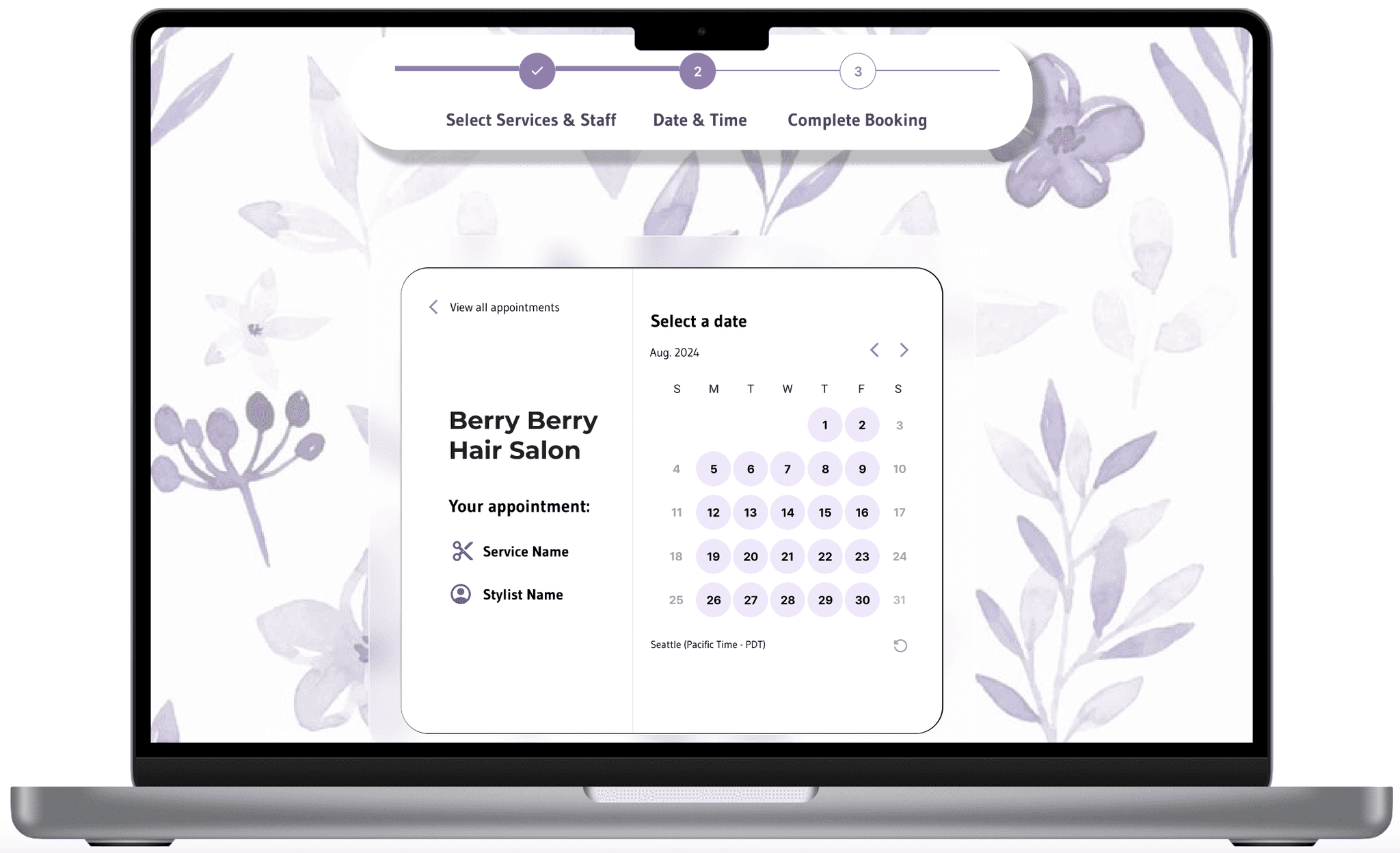
Streamlined Booking:
Integrated 5-step booking system
Streamlined Booking:
Integrated 5-step booking system
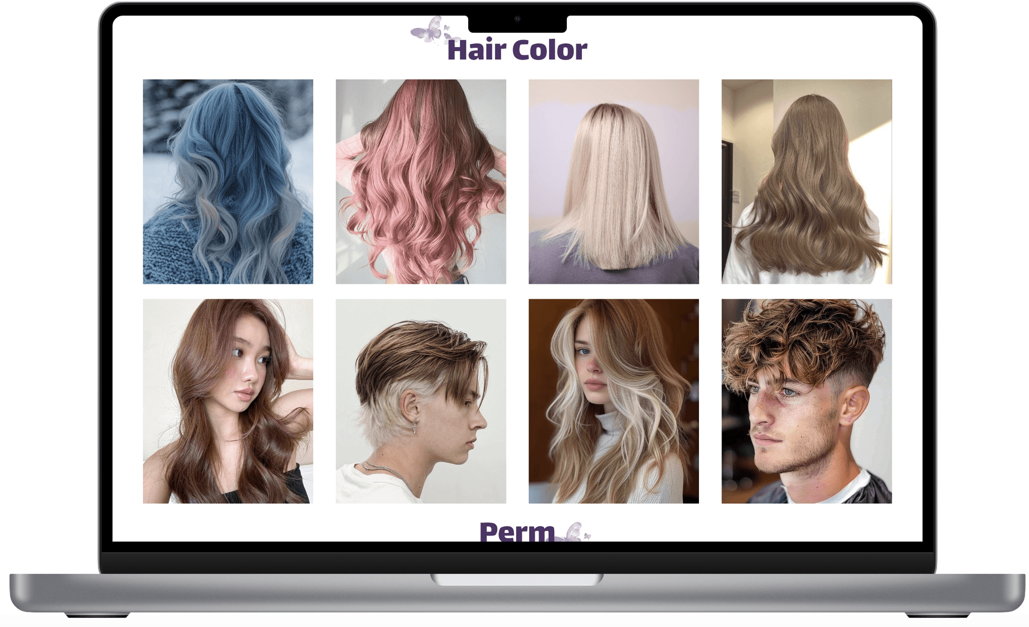
Enhanced Content:
Categorized style gallery
Enhanced Content:
Categorized style gallery
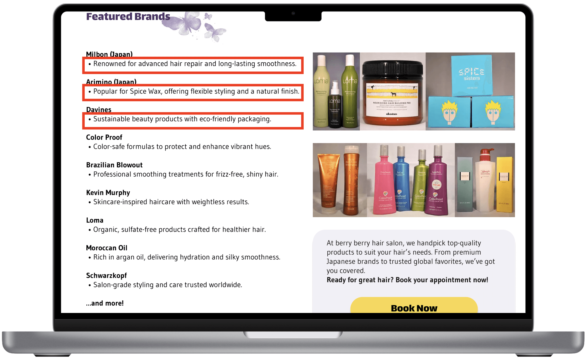
Enhanced Content:
Product descriptions
Enhanced Content:
Product descriptions
Enhanced Content:
Comprehensive salon information
(operation hours, social media, reviews, contact form)
Enhanced Content:
Comprehensive salon information
(operation hours, social media, reviews, contact form)
Looking Forward
Looking Forward
Opportunities Remain
Opportunities Remain
Online payment integration
Client review integration
Membership and loyalty program
Online payment integration
Client review integration
Membership and loyalty program
Key Learnings
Key Learnings
Don't Overcomplicated
Early Prototypes
Don't Overcomplicated
Early Prototypes
In the initial stages of the design process, I found myself getting too detailed with wireframing and mid-fidelity prototypes. While it was tempting to make the designs more polished to better communicate my ideas, it consumed valuable time and energy. Early on, rough sketches and mid-fidelity wireframes would have sufficed to test ideas and gather feedback. Next time, I’ll remind myself to focus on functionality and leave aesthetics for later stages.
In the initial stages of the design process, I found myself getting too detailed with wireframing and mid-fidelity prototypes. While it was tempting to make the designs more polished to better communicate my ideas, it consumed valuable time and energy. Early on, rough sketches and mid-fidelity wireframes would have sufficed to test ideas and gather feedback. Next time, I’ll remind myself to focus on functionality and leave aesthetics for later stages.
Balance Creativity With Project Scope
Balance Creativity With Project Scope
During ideation, I explored multiple ambitious ideas, such as advanced AI-based hairstyle recommendations and extensive customization options for bookings. However, these exceeded the project’s scope and risked derailing the timeline. I learned that while creativity is essential, it’s equally important to ground ideas in feasibility and prioritize features that directly address user pain points.
During ideation, I explored multiple ambitious ideas, such as advanced AI-based hairstyle recommendations and extensive customization options for bookings. However, these exceeded the project’s scope and risked derailing the timeline. I learned that while creativity is essential, it’s equally important to ground ideas in feasibility and prioritize features that directly address user pain points.
Value Every Bit of
User Feedback
Value Every Bit of
User Feedback
User-centered design means always keeping the user at the forefront, and this project reminded me why that’s so crucial. In interviews, users suggested features like a categorized gallery for hairstyles, which became a central part of the redesign. Later, usability testing revealed critical issues, such as the absence of a back button at each step of the booking process, which caused significant frustration. Addressing these insights led to a smoother, more intuitive experience. I learned that user feedback isn’t just helpful—it’s essential for uncovering both creative opportunities and usability pain points that might otherwise be overlooked.
User-centered design means always keeping the user at the forefront, and this project reminded me why that’s so crucial. In interviews, users suggested features like a categorized gallery for hairstyles, which became a central part of the redesign. Later, usability testing revealed critical issues, such as the absence of a back button at each step of the booking process, which caused significant frustration. Addressing these insights led to a smoother, more intuitive experience. I learned that user feedback isn’t just helpful—it’s essential for uncovering both creative opportunities and usability pain points that might otherwise be overlooked.